American PhilatelicPrevious | American Philatelic Index | NextHome |
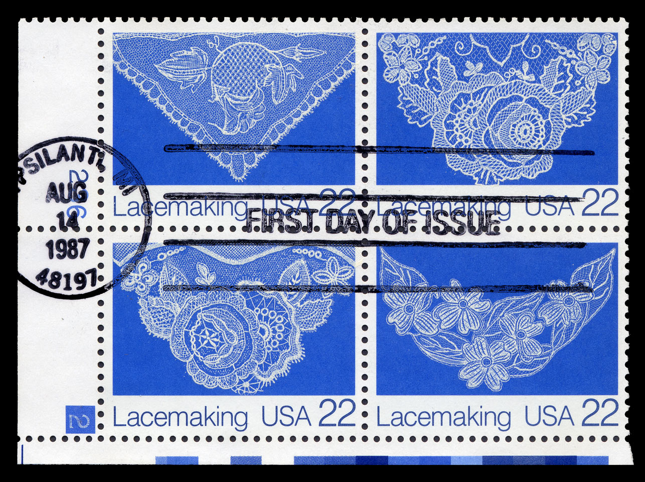
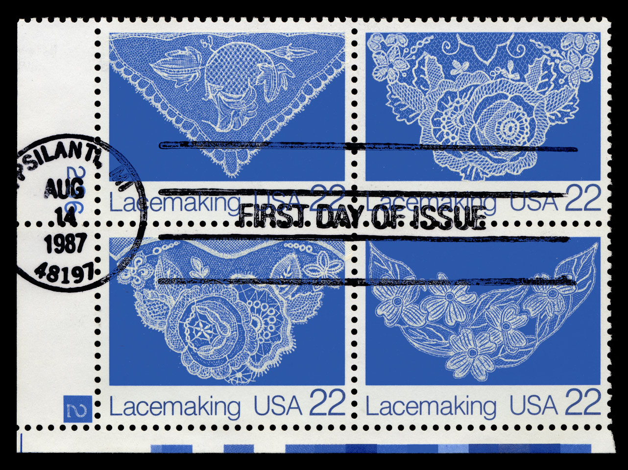
Cancelled Plate Block - color study Plate number block or “plate block” of the 4 lacemaking stamps showing the plate number used in printing the sheet. The white block number in the square of blue is considered unusual. This block has a First Day of Issue postmark and cancellation. Actually, this isn't the most interesting item in my collection, so I took the liberty of some experimentation in Photoship. Color can be difficult to process on the web. The scanner might not give true colors, and the average computer screen drifts out of color calibration over time - the owner will normally have no clue how to fix it. I go over some of these issues in my Photography menu on the home page. What I wanted to try here is to substitute the background color of the scan of this piece with the PMS* 286U color that the stamps were actually printed with. I didn't try to adjust the lettering to the PMS* 288U; I'll work on that another time. This little exercise took a long time and taught me a lot about color in printing. The upper scan is directly off my trusty (and 7 year old) Epson Perfection 2400 Photo scanner, that has done the majority of my work for this web site. It was scanned at my working 600 dpi, with no further adjustment in Photoshop other than to blacken the background. I use the I-1 color calibration system for my flat-screen monitor, and my home system this stamp appears a bright clean blue. With the monitor calibration done, I'm certain that the color itself is due solely to the scanner. I now scanned the block at very high resolution - 3000 dpi. Took forever. But I wanted as even a color pixel surface as possible - the scanner tends to add too much light reflenction at a very small scale with coarser resoutions. All this is evened out in my color adjustment process. Photoshop has a color library, and I selected Pantone 286 U, which I think is the original printed color. PMS means "Pantone Matching System". I don't know what the * means. I then selected a color range on the image in the background so that everything blue appeared highlighted, as far as I could tell. I think Looks like I lost a little bit of the white net ground detail in the 'left facing rose' (lower left) in this process, but it was an adventure just getting this far. Photoshop started to complain as I rotated and resized everything, and made the black background true - running out of RAM. So at one point I had to go to web-based jpg, which cut the size from > 100 MBytes to around 17MB. Working with files this big takes a long time, about an hour to complete this project. Which one is correct? If I hold up the original sample, it does seem to resemble the color adjusted piece more, although there is a bit of brightness that doesn't come through on the screen. Exactly how the final color turns out is a function of the two original layers of color, time, oxidation, and many factors. But we now have a reference for the original color. How your own computer screen is calibrated is anyone's guess; but this is about all I can do. Obviously (see the Previous web page) I have not taken similar care with other scanned examples of the Lacemaking stamp. Just remember, color is a very tricky subject. See my Vermeer stamp for another interesting color exercise. first posted 1/10/2009 |
  |